

Designing a template
A template can be valid and still be poor: everything in its place, nothing that makes someone want to read it. This page is about the other half — the design decisions that make a flyer, a price list or a certificate look like the work of a designer. They are the decisions the Madoo examples make, written down so that an agent can make them too.
The short version: decide the purpose and the hierarchy first, work on a grid, use few type sizes and few colors, use real images, design for the longest and the shortest data, and look at every render before you call it done.
1. Start from the purpose
Section titled “1. Start from the purpose”Before any element, answer three questions in a sentence each:
- Who reads it, where and for how long? A WhatsApp flyer is read on a phone in three seconds; a price list is consulted at a restaurant table; a certificate is framed.
- What is the one thing they must take away? The event and its date; the product and its price; the name and the achievement.
- What must be exactly right? Prices, legal notes, names, dates — the facts that come from data and must never be rewritten.
The answers decide the hierarchy: one dominant element (a title, a photo, a price), two or three secondary ones, and everything else quiet. A page where everything is bold has no hierarchy.
2. Work on a grid
Section titled “2. Work on a grid”- Margins. 40 pt on A4 is the Madoo examples’ default; 36–56 pt all work. Keep the same margin on every page.
- Columns. Decide the columns before placing anything — one wide column for a letter-like proposal; two for a brochure page; a grid of cards (two, three or four across) for a catalog. Align every block to the column edges.
- A spacing scale. Use a few spacing values and repeat them: 4, 8, 12, 16, 24, 32, 48. Gaps inside a card are small (8–12), gaps between sections are large (24–32). Consistent spacing is what makes a page look designed.
- Fewer left edges. Count the distinct left positions on the page; a clean page has three or four.
Flowing Layouts (layout_region) apply padding and gaps for you, and keep them when content changes.
3. Typography: few roles, clear steps
Section titled “3. Typography: few roles, clear steps”Pick two or three type roles, each with a job, and a small set of sizes with clear steps between them.
| Role | What it is for | In the examples |
|---|---|---|
| Display | titles, the one thing to remember | a serif (Playfair Display), bold, 24–52 pt, line height 1.05–1.15 |
| Label | eyebrows, section names, badges, prices | a geometric sans (Montserrat), bold, 7–13 pt; small labels in capitals with letter spacing 100–150 (charSpacing, thousandths of an em) |
| Body | paragraphs, descriptions, list rows | a readable sans (Inter), 9.5–12 pt, line height 1.35–1.5 |
- Size steps should be visible: 9 → 12 → 16 → 24 → 40, not 11 → 12 → 13.
- Body text under 9 pt is for footnotes only; on a phone-read flyer keep it at 11–12.
- Line length: 45–75 characters per line for paragraphs; wider text blocks need a larger size or two columns.
- Weights: bold for display and labels, regular for body. Italic for a quote or an edition line, sparingly.
- Fonts must exist in the workspace (the built-in families, or fonts uploaded to the workspace), and they must contain every character you print: a glyph missing from a font does not print, silently. Check symbols such as →, €, ², ✓ in a preview.
4. Color: one accent, used with intent
Section titled “4. Color: one accent, used with intent”The examples use the same structure every time — five colors, each with a job:
| Job | Example values |
|---|---|
| Ink — body text, dark bands | #1c2430, #23302f, #0b1f33 |
| Muted — secondary text, captions | #5c6663, #667085, #64748b |
| Accent — price, badge, call to action, one detail | #c0643a, #f2a541, #c8a45c |
| Paper — the page background | #f6f1e7, #f1ece3, #f4f6f8 (a warm or cool off-white, rarely pure white) |
| White — text on dark bands, cards on paper | #ffffff |
- Use the accent for a few things only — if everything is orange, nothing stands out.
- Contrast: dark ink on paper, white on the ink band; never light gray on white for text someone must read.
- A brand’s color can arrive as a color field, so one template serves several brands.
- Gradients belong to backgrounds and veils over photos (a dark gradient under white text on a photo), not to text.
5. Images carry the page
Section titled “5. Images carry the page”- Use real images: the product, the place, the people. A good photo does more than any decoration.
- Fill for photos, fit for logos:
fillcovers its box and crops the excess;fitshows the whole logo without cropping. Set the focal point when the subject is not in the centre. - Frames: rounded corners or a circle soften a photo on a card; keep the same frame on every item of a list.
- Size for print: a photo that fills half an A4 page needs about 1500 px on its long side to look sharp.
- AI images in a workflow: generate them in the proportions of their box (a 16:9 header, a 1:1 card), and in one consistent style for a list.
- A background image under text needs a veil (a semi-transparent dark rectangle or gradient) to keep the text readable.
6. Design for the data you will really get
Section titled “6. Design for the data you will really get”The same template will receive a short title and a long one, three products and nine, a logo and no logo. Design every variable element for its extremes:
- Texts that vary grow within limits. Give a title
growwithmaxLines: 2andbeyond: shrink; give a description six lines and then an ellipsis. Decide what happens beyond the limit — shrink, cut, or fail loudly withbeyond: failwhen a cut would be wrong (a legal note). - Put variable blocks in a flowing Layout, so a short text pulls up what follows and a long one pushes it down, instead of leaving holes or overlapping.
- Lists have a ceiling (
maxItems) and a decision for overflow: fail, shrink the rows, drop the extra items, or continue on a new page. - Absent is a state, not a hole: hide the logo card when there is no logo, show a friendly message when a list is empty — with conditions, which in a Layout also remove the gap.
- Numbers are formatted by the template, not by the data: the price field says currency, locale and decimals.
- Test the extremes with sample sets: the longest title, the most items, the empty list, every badge.
7. Look at every render
Section titled “7. Look at every render”A template is judged by its pages. After every significant change, render each sample set
(preview_design_template_sample_set, or the editor’s preview) and look at the image, asking:
- Is the hierarchy right — does the eye go first to the one thing that matters?
- Do the blocks align to the grid? Are the margins equal? Is any spacing out of the scale?
- Does any text overflow, get cut, or shrink to an unreadable size? Does any list hit its ceiling?
- Is there an empty area that looks like a mistake? An element that overlaps another?
- Is every character printed (symbols, accents)? Is the contrast enough?
- Does the page still look good with the other sample sets?
Fix, render again, and repeat until every sample set looks right. Then check readiness and publish.
Worked example: the event poster
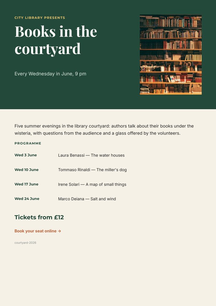
Section titled “Worked example: the event poster”The event poster applies the rules above on one A4 page:
- Purpose: a passer-by must get what (the title), when (the dates) and how much (the price) at a glance.
- Hierarchy: the title is the dominant element (Playfair Display 40 pt, white on the dark band); the photo is second; the programme third; the price is the only accent-coloured number on the page besides the booking link.
- Grid: 40 pt margins; the band holds two columns — text on the left, photo on the right; the body is one column in a flowing Layout with 16 pt between blocks and 8 pt between programme rows.
- Type: three roles — Playfair Display for the title, Montserrat capitals with 120 letter spacing for the eyebrow and the PROGRAMME label, Inter for the body.
- Color: ink green
#23493a, paper#f6f1e7, gold#e9c46afor the eyebrow, terracotta#c0643afor the link. - Variable data: the title grows to two lines and then shrinks; the introduction to six lines; the programme is a
list of up to six evenings that pushes the price down or pulls it up; the sold out badge prints only when
sold_outis true.
Checklist before publishing
Section titled “Checklist before publishing”- One dominant element; two or three levels of hierarchy, no more.
- Equal margins; blocks on a grid; spacing from a small scale.
- Two or three type roles; visible size steps; body text readable at its real size.
- Five colors at most, one accent used sparingly, readable contrast everywhere.
- Real images,
fillfor photos andfitfor logos, sharp at print size. - Every variable text has a growth rule; variable blocks sit in flowing Layouts.
- Lists have a ceiling and an overflow decision; empty and absent states are designed.
- Numbers are formatted by the template.
- Sample sets cover the longest, the shortest and every branch — and every one of them has been looked at.