

Images
Images carry a page more than any decoration: the product, the place, the people, the brand. This page covers the image element — fixed artwork and image fields — how it fills its box, how to crop it into a shape, how to keep text readable over a photo, and how to put a photo behind a whole page. As on every technique page, each technique is shown in the editor and in the document.
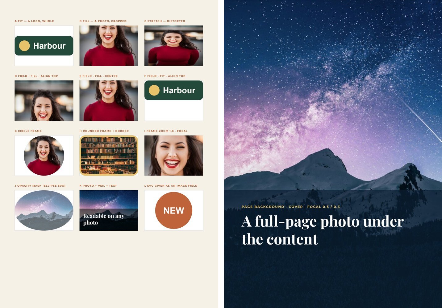
Every example is in the image lab, a two-page template: the first page shows the techniques side by side, the second a full-page background.
Where an image comes from
Section titled “Where an image comes from”The src of an image — or the value of an image field — can be:
| Source | Example | Notes |
|---|---|---|
| A Madoo storage path | the path returned by an upload |
The right choice for a template that will be shared or published: stored images travel with the template |
| An HTTPS URL | https://images.example.com/courtyard.jpg |
Fetched at render time; it must stay reachable. Plain HTTP is rejected |
| A data URI | data:image/png;base64,…, data:image/svg+xml;base64,… |
Small images such as a generated badge or a logo |
Photos in PNG, JPEG, WebP or GIF; SVG is accepted too, and prints as vectors at its own proportions — useful for logos and badges produced by a workflow. A single image may be up to 20 MiB, and a render up to 100 MiB of images in total.
To bring a file into Madoo, upload it (upload_asset in MCP, POST /api/v1/assets in REST); list_assets finds
files already there. See Assets.
Fit, fill or stretch
Section titled “Fit, fill or stretch”An image has a box (left, top, width, height) and a fitMode that decides how the picture meets it.
fitMode |
What happens | Use it for |
|---|---|---|
fit |
The whole picture is shown, as large as the box allows; the rest of the box stays empty | Logos, badges, product cut-outs, anything that must never be cropped |
fill |
The picture covers the box; what exceeds is cropped | Photos — the usual choice |
stretch |
The picture takes exactly the box, distorted if the proportions differ | Almost never: only textures and patterns |
{ "$type": "image", "id": "5c0de444-0000-4000-8000-000000000101", "name": "Hero photo", "left": 40, "top": 40, "width": 515, "height": 300, "src": "https://images.unsplash.com/photo-1507842217343-583bb7270b66?w=1200", "fitMode": "fill" }With fill, a fixed image is cropped around its centre. To keep another part of it — a face near the top, a
product on the right — give it a frame with a focal point (see Frames), or
make it a field and choose an alignment.
In the editor
Choose Add image in the tool bar on the left and click on the page, then Add image (or Replace image) in the image bar to upload a PNG, JPEG, WebP or GIF. Image options chooses Photo fit: Fit, Fill or Stretch. An SVG file is imported as editable vector artwork rather than as a picture — see the vector artwork page.
Image fields
Section titled “Image fields”An image becomes a field with a placeholder of type image: its picture comes from data. The field carries
its own fitMode and an alignment — top_left, top_center, top_right, center_left, center,
center_right, bottom_left, bottom_center, bottom_right — which decides which part of the box the picture
keeps:
- with
fill, the alignment is the part of the photo that survives the crop:top_centerkeeps the heads of a portrait,bottom_centerthe feet of a product on a floor; - with
fit, it is where the picture sits in the box:top_centerputs a logo at the top of its space,center_leftaligns it with the text on its left.
{ "$type": "image", "id": "5c0de444-0000-4000-8000-000000000102", "name": "Speaker portrait", "left": 40, "top": 220, "width": 160, "height": 110, "src": "", "fitMode": "fill", "placeholder": { "id": "5c0de444-0000-4000-8000-000000000103", "name": "Speaker portrait", "code": "portrait", "placeholderType": "image", "required": true, "fitMode": "fill", "alignment": "top_center", "description": "A portrait photo; the face in the upper half." } }Say in the field’s description what picture is expected and where its subject is: it is what a person or an
agent reads when preparing the data. A workflow that generates the picture should generate it in the proportions of
the box.
In the editor
Choose Add image placeholder in the tool bar, or select an image and choose Make Placeholder from the …
menu of its action bar. In the dialog, with Value type Image, set Fit Mode and click a cell of the
Alignment grid.
Frames: shapes, focal point and zoom
Section titled “Frames: shapes, focal point and zoom”A frame crops an image into a shape — a circle for a portrait, rounded corners for a card, any closed vector path — and places the picture inside it independently of the box. It is written as two properties:
clipPath— the shape, as an SVG path in points relative to the image’s top-left corner;frame— how the picture sits in the shape:focalXandfocalY(0–1, the point of the picture kept in view: 0.5/0.3 keeps the upper middle),scale(zoom, 1 = the picture just covers the shape),offsetX/offsetY(points),rotation(degrees), and an inside border withstrokeColorandstrokeWidth.
A circular portrait, 110 × 110, keeping the face:
{ "$type": "image", "id": "5c0de444-0000-4000-8000-000000000104", "name": "Round portrait", "left": 65, "top": 370, "width": 110, "height": 110, "fitMode": "fill", "src": "https://images.unsplash.com/photo-1494790108377-be9c29b29330?w=800", "frame": { "focalX": 0.5, "focalY": 0.3, "scale": 1, "offsetX": 0, "offsetY": 0, "rotation": 0 }, "clipPath": { "units": "user_space_on_use", "transform": [], "shapes": [ { "pathData": "M 55 0 A 55 55 0 1 1 55 110 A 55 55 0 1 1 55 0 Z", "fillRule": "non_zero", "transform": [], "opacity": 1, "luminance": 1, "color": "#000000" } ] } }- Rounded corners: a path with quadratic corners — for a 160 × 110 card with radius 18:
M 18 0 H 142 Q 160 0 160 18 V 92 Q 160 110 142 110 H 18 Q 0 110 0 92 V 18 Q 0 0 18 0 Z. - Zoom on a detail: the same frame with
"scale": 1.8and a focal point on the subject. - A border that follows the shape:
"strokeColor": "#e9c46a", "strokeWidth": 4inframe— drawn inside the shape. - An image field can have a frame too: every picture the data brings is cropped into the same shape — the way to give every card of a list the same rounded photo.
In the editor
Select the image and choose Crop / mask: pick a Mask shape (rectangle, ellipse, circle, triangle, diamond, star), drag inside to move the photo, use Mask handles or Photo handles to resize one or the other, edit the contour’s points, then Done. Any rectangle, ellipse or vector path you drew becomes a frame too: select it and choose Use as image frame, or select it together with the image and choose Use shape as frame. The border is under Image options (Border width, Border color); Remove mask releases the image.
Opacity masks
Section titled “Opacity masks”An opacity mask makes part of an image transparent: outside the mask the image disappears, inside it keeps the mask shape’s opacity. A soft oval vignette, a photo that fades into the page:
"opacityMask": { "units": "user_space_on_use", "contentUnits": "user_space_on_use", "x": 0, "y": 0, "width": 160, "height": 110, "transform": [], "shapes": [ { "pathData": "M 80 0 A 80 55 0 1 1 80 110 A 80 55 0 1 1 80 0 Z", "fillRule": "non_zero", "transform": [], "opacity": 0.6, "luminance": 1, "color": "#ffffff" } ] }The mask is vector: it stays sharp in the PDF.
In the editor
Select the image together with a closed shape and choose Use shape as alpha mask.
Text on a photo
Section titled “Text on a photo”Text directly on a photo is readable only where the photo happens to be dark or plain. Put a veil between them:
a rectangle in the ink color at 50–70% opacity, over the part of the photo that holds the text — or a gradient
from transparent to dark, for a softer edge. Then white or light text on the veil.
{ "$type": "rectangle", "id": "5c0de444-0000-4000-8000-000000000105", "name": "Veil", "left": 0, "top": 520, "width": 595, "height": 322, "fill": "#0b1f33", "opacity": 0.7 }Elements are painted in order: the photo first, the veil, then the text.
A photo behind the whole page
Section titled “A photo behind the whole page”A page can have a background image above its background color or gradient. It always covers the page from edge to edge and sits behind every element.
"backgroundColor": "#0b1f33","backgroundImage": { "src": "https://images.unsplash.com/photo-1519681393784-d120267933ba?w=1600", "fitMode": "cover", "focalX": 0.5, "focalY": 0.3, "scale": 1 }fitMode:coverfills the page and crops the edges;containshows the whole picture, with the background color around it;stretchdistorts it to the page.focalX/focalYchoose the part kept in view;scale(0.25–4) enlarges or reduces it — below 1 it reveals the color underneath.- Transparent areas of a PNG show the background color or gradient.
A background image is part of the design, not a field. For a background that changes with the data, place an image field covering the whole page as the first element instead.
In the editor
Open Page settings from the page thumbnails. Under Background, Image overlay (optional) uploads the picture; Fit to page chooses Fill page (crop edges), Show whole image or Stretch to page; Image size scales it; drag the picture in the small preview to position it.
QR codes
Section titled “QR codes”A QR code on a page is an image field fed by the QR Code & Barcode node (image/code) of the workflow. Connect its svg
output to the field: the code stays vector in the PDF and prints sharp at any size. In a workflow that makes one
document per item (a badge per participant, a label per product), put the node after the enumerator — every item
gets its own code, as in the F13 event badges.
- Style: module shape (
square,rounded,circle,dots,diamond,heart,star), eye frame and eye ball shapes, code, eye and background colours, an optional centre logo (SVG, PNG or JPEG). A white or light logo needs Logo Background (square,rounded,circle): a plate behind it, in the code colour unless you choose another. - It always scans: the node decodes every code it draws; a style that stops it from scanning — a pale colour, a
logo too large — fails the node instead of reaching the printer. Its
checkoutput says what was read. - In the editor, the node’s panel shows the code above its parameters, redrawn as you change them, with whether it scans. It is the run’s own drawing (nothing is stored, no credits); without content yet it shows a sample, and a logo computed during the run is left out of the preview.
- In the template: an image field with
fit, square, at least 2 cm on paper (80 points), with white or a light colour around it; the node’s quiet zone (4 modules) is the margin scanners need. - A frame with “Scan me” is part of the template, not of the code — see Frames around a QR code.
- To hand the code over as a file, connect it to an Image Output (
output/image): formatoriginalkeeps thesvgoutput vector (a.svgfor the printer or the designer);png,jpgorwebpconvert it.
Barcodes: EAN-13 and Code 128
Section titled “Barcodes: EAN-13 and Code 128”The same node draws barcodes: set Symbology to ean13 or code128.
| Symbology | Use it for | Content |
|---|---|---|
ean13 |
Retail products: packaging, shelf and price labels | 12 digits — the check digit is added — or 13, when the check digit is verified; spaces and dashes are ignored |
code128 |
Labels, tickets, logistics: an order, a SKU, a lot, a badge ID | Letters, digits and symbols (printable ASCII), up to 48 characters |
- It always scans, as a QR code: the drawn barcode is read back and must give the content (an EAN-13 gives its 13 digits). A wrong check digit is refused with the right one — the check digit of ‘5901234123458’ should be 7.
- The human-readable line (on by default, Human-Readable Text) is drawn under the bars as vector outlines: the SVG carries no font, so it prints the same in any PDF, a PDF/X print file included. An EAN-13 follows the GS1 layout — the first digit left of the bars, two groups of six, the guard bars running down into the digits.
- Size and margins: the usual height is kept (69 modules for an EAN-13), Bar Height changes it; the standard quiet zones are always drawn (11 and 7 modules for EAN-13, 10 for Code 128). Code and background colours apply as for QR codes; shapes, logos and error correction are for QR codes only.
- In the template: an image field with
fit, as wide as the barcode needs — an EAN-13 is about 37 mm wide at its nominal size (100%), and should not print below 80% of it; keep white around it.
Frames around a QR code
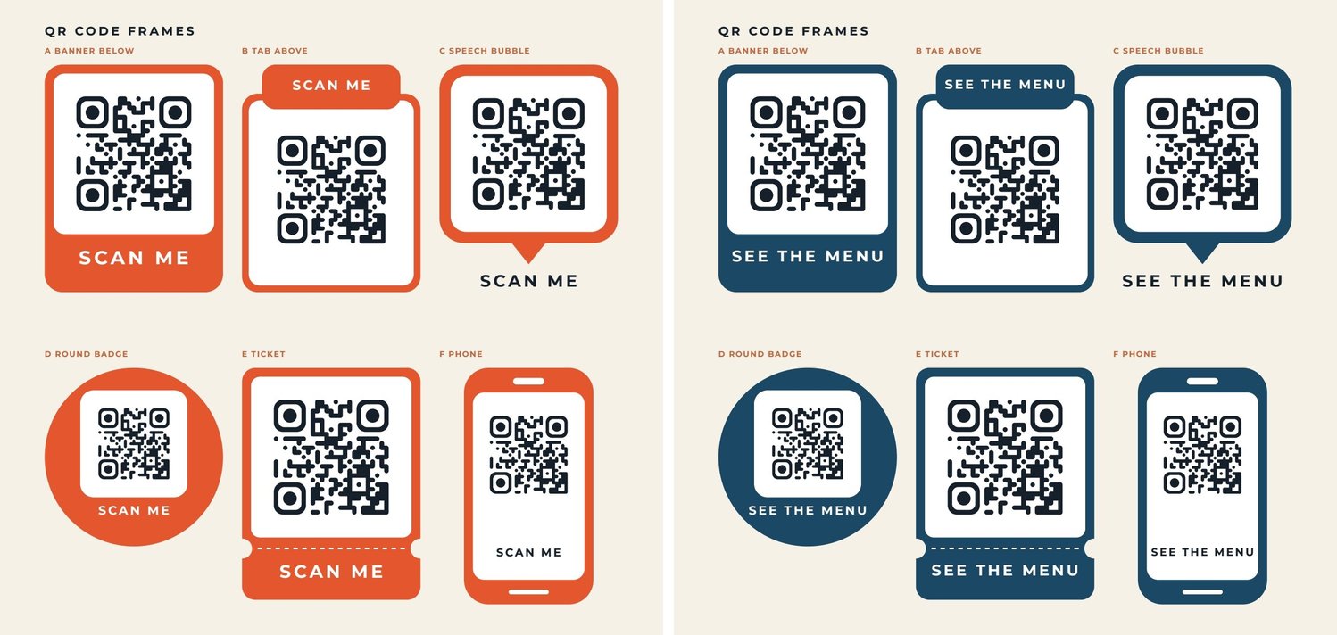
Section titled “Frames around a QR code”A sticker frame — a banner that says SCAN ME, a speech bubble, a ticket — is drawn in the template around the image
field, in the brand’s fonts and colours; the code itself stays plain, so it always scans. The
QR frames lab has six frames fed by three fields: qr (the image),
call_to_action (the text) and frame_color (a colour field on every coloured shape). Its two sample sets show the
same page in two brands:
| Frame | How it is built |
|---|---|
| A Banner below | A coloured rounded rectangle; a white rounded card inside it with the code; the call to action in white on the colour under the card |
| B Tab above | A coloured border (a rounded rectangle with a white one inside), and a coloured tab overlapping its top edge with the text |
| C Speech bubble | A coloured rounded square and a triangular path pointing down, both with the colour field; the text in ink under the pointer |
| D Round badge | A coloured circle; a white rounded card inside the circle, the code on it and the text in white below |
| E Ticket | A coloured rounded rectangle; two circles in the page colour cut the notches; a dashed white line is the perforation |
| F Phone | A coloured rounded rectangle is the body, a white one the screen, two small white bars the speaker and the home bar |
Frame A:
{ "$type": "group", "id": "9f5a0000-0000-4000-8000-000000000010", "name": "Banner below", "left": 40, "top": 58, "width": 160, "height": 220, "children": [ { "$type": "rectangle", "id": "9f5a0000-0000-4000-8000-000000000003", "name": "Frame", "left": 0, "top": 0, "width": 160, "height": 204, "fill": "#e4572e", "rx": 16, "ry": 16, "placeholder": { "id": "9f5a0000-0000-4000-8000-000000000004", "name": "Frame colour", "code": "frame_color", "placeholderType": "color", "required": true, "format": {"colorTarget":"fill"}, "description": "The frame colour, #RRGGBB; white text must read on it." } }, { "$type": "rectangle", "id": "9f5a0000-0000-4000-8000-000000000005", "name": "Card", "left": 8, "top": 8, "width": 144, "height": 144, "fill": "#ffffff", "rx": 10, "ry": 10 }, { "$type": "image", "id": "9f5a0000-0000-4000-8000-000000000006", "name": "QR code", "left": 12, "top": 12, "width": 136, "height": 136, "src": "", "fitMode": "fit", "placeholder": { "id": "9f5a0000-0000-4000-8000-000000000007", "name": "QR code", "code": "qr", "placeholderType": "image", "required": true, "fitMode": "fit", "alignment": "center", "description": "The QR code: the svg output of the QR Code node, square." } }, { "$type": "text", "id": "9f5a0000-0000-4000-8000-000000000008", "name": "Call to action", "left": 12, "top": 164, "width": 136, "height": 30, "text": "SCAN ME", "fontFamily": "Montserrat", "fontSize": 17, "fontWeight": "bold", "fill": "#ffffff", "charSpacing": 160, "textAlign": "center", "lineHeight": 1.1, "fixedHeight": 30, "overflowMode": "shrink", "minFontSize": 6, "placeholder": { "id": "9f5a0000-0000-4000-8000-000000000009", "name": "Call to action", "code": "call_to_action", "placeholderType": "text", "required": true, "description": "A short call to action, e.g. \"SCAN ME\" or \"SEE THE MENU\"." } } ] }What makes a frame work:
- The code sits on white. Put it on a white or very light card inside the frame, never directly on the frame colour, and keep the node’s quiet zone: the card is decoration, the quiet zone is what the scanner needs.
- One field, many places. The same code (
frame_color) can sit on several shapes when every occurrence has the same contract — name, type, requirement, format — so one value paints the whole frame. - One field per element. A text that is the call-to-action field cannot also take its colour from a field: give it a fixed colour that reads on every frame colour — white on the colour, ink on the page.
- A short call to action that stays inside. Keep it on one line — a fixed height with
shrinkand a smallminFontSize, orgrowwithmaxLines: 1andbeyond: shrink— and keep its box a few points inside the frame’s rounded corners: SEE THE MENU shrinks where SCAN ME fits.
Recipes
Section titled “Recipes”| You need | Do |
|---|---|
| A logo that is never cropped | fit, aligned to the side of the text it goes with |
| Product photos on a white background, all the same | Image fields with fit and bottom_center alignment: every product stands on the same line |
| Portraits in a list of speakers | An image field with fill, a circle frame and focalY around 0.3 |
| A hero photo with a title on it | The photo with fill, a veil rectangle at 60% over the lower part, the title in white on it |
| A card photo with rounded corners | A frame with a rounded path; the same frame on every card |
| A badge produced by a workflow | An image field with fit fed an SVG data URI or file |
| A barcode on a price label or a shipping label | The QR Code & Barcode node with ean13 (a GTIN) or code128 (a SKU, an order), its svg output into an image field with fit |
| A QR code with SCAN ME in the brand’s colours | A frame from the QR frames lab: shapes with a colour field around a square image field fed by the QR Code node |
| A QR code per participant or product | The QR Code node after the enumerator, its svg output into a square image field |
| A cover with a full-page photo | backgroundImage with cover and a focal point on the subject, a veil under the text |
Checklist
Section titled “Checklist”- Photos use
fill, logos and cut-outs usefit; nothing important is cropped (check every sample set). - Every image field says in its
descriptionwhat picture it expects and where the subject is. - Portraits and subjects off-centre have an alignment or a focal point.
- Text over a photo sits on a veil.
- Photos are large enough for their printed size (about 1500 px on the long side for half an A4 page).
- Images of a template that will be shared are in Madoo storage, not on an external URL.