

Flowing layouts
On a page, every element sits where it was drawn. That is right for a fixed design and wrong for variable data: a
title that takes three lines instead of one overlaps the text below it, a description of one line leaves a hole,
a badge that is absent leaves an empty space. A Layout (layout_region) solves this the way a web page does:
its elements are arranged one after the other, with fixed padding and gaps, and when one of them grows, shrinks
or disappears, the others move.
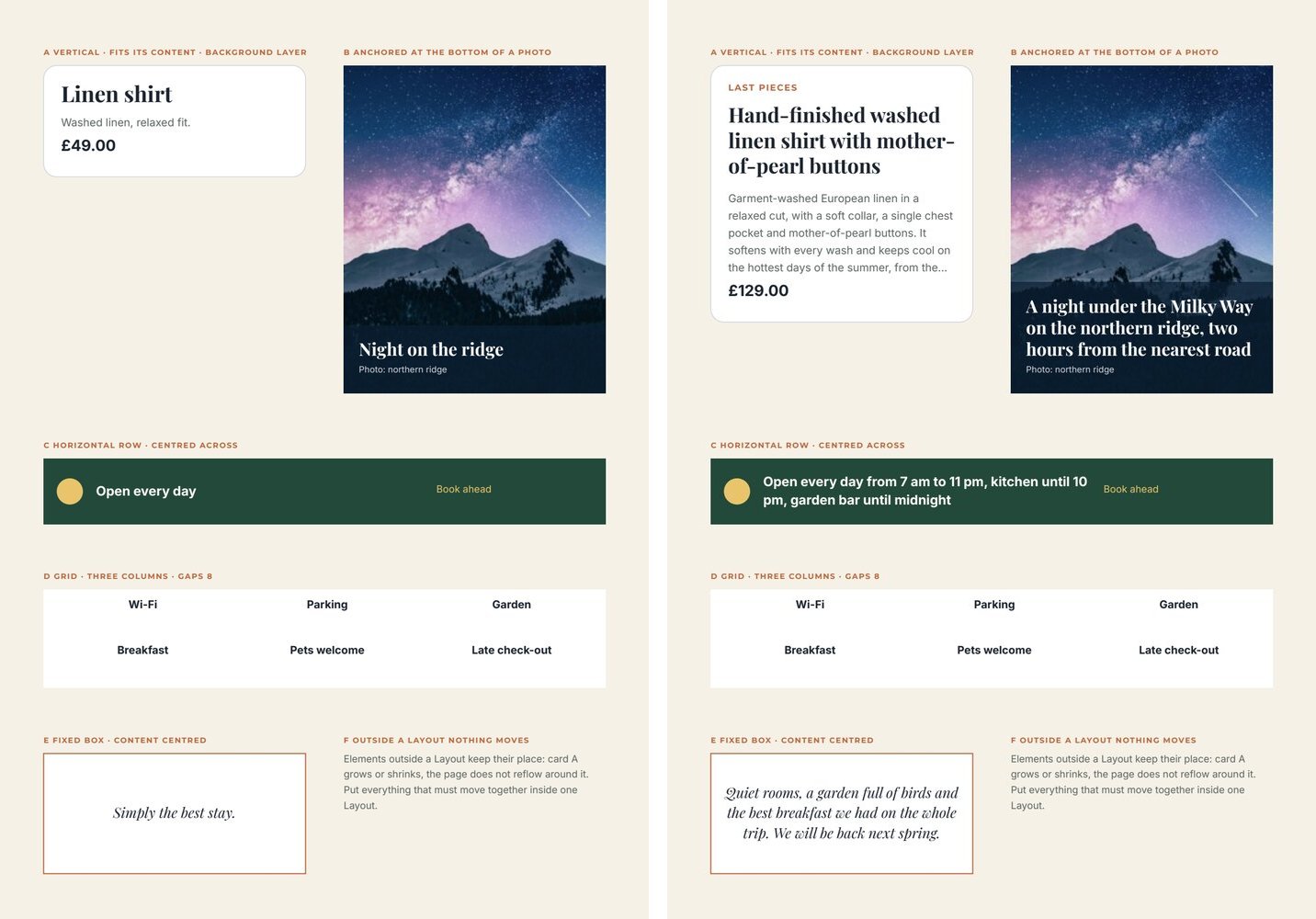
This page shows in the editor and in the document how to build them. Every example is in the layout lab, rendered here with its two sample sets — short values on the left, long values on the right. Nothing was moved by hand between the two.
The idea: a box that arranges its children
Section titled “The idea: a box that arranges its children”A Layout is a container. Its children are positioned relative to the Layout, and its layout settings decide
how they are arranged:
| Setting | Values | What it does |
|---|---|---|
mode |
vertical, horizontal, grid, absolute |
A stack, a row, a grid of equal columns — or free positions (absolute, the children stay where drawn) |
childSizing |
content, drawn |
content makes the Layout flow: texts with a growth rule take the lines they need, hidden elements take no space. drawn keeps every child at its drawn size |
sizing |
hug, fixed |
hug: the Layout is exactly as large as its content plus padding. fixed: it keeps its drawn size |
anchor |
start, center, end |
For a hug Layout, the edge that stays in place when it grows: start grows downwards, end grows upwards |
paddingTop … paddingLeft |
points | Space between the Layout’s edge and its content |
rowGap, columnGap |
points | Space between children |
columns |
1–12 | Columns of a grid |
crossAxisAlignment |
start, center, end |
Each child across the flow: left/centre/right in a stack, top/middle/bottom in a row |
mainAxisAlignment |
start, center, end |
The whole content along the flow, in a fixed Layout with free space |
cornerRadius |
points | Rounds the background layers |
For templates filled with data, the combination you want almost always is childSizing: "content" — without
it, nothing flows.
A vertical stack that follows its content
Section titled “A vertical stack that follows its content”The product card of the lab: a badge that may be absent, a title of one to three lines, a description of up to five lines, a price — always 8 points apart, 16 points from the card’s edge, and the card as tall as what it holds.
{ "$type": "layout_region", "id": "5c0de666-0000-4000-8000-000000000002", "name": "Card", "left": 40, "top": 60, "width": 240, "height": 300, "layout": { "mode": "vertical", "sizing": "hug", "childSizing": "content", "paddingTop": 16, "paddingRight": 16, "paddingBottom": 16, "paddingLeft": 16, "rowGap": 8, "cornerRadius": 12 }, "children": [ { "$type": "rectangle", "id": "5c0de666-0000-4000-8000-000000000003", "name": "Card background", "left": 0, "top": 0, "width": 240, "height": 300, "fill": "#ffffff", "stroke": "#d0d5dd", "strokeWidth": 0.75, "layoutBackground": true }, { "$type": "text", "id": "5c0de666-0000-4000-8000-000000000004", "name": "Badge", "left": 16, "top": 16, "width": 120, "height": 12, "text": "LAST PIECES", "fontFamily": "Montserrat", "fontSize": 8, "fontWeight": "bold", "fill": "#c0643a", "charSpacing": 120, "placeholder": { "id": "5c0de666-0000-4000-8000-000000000005", "name": "Badge", "code": "badge", "placeholderType": "text", "required": false }, "condition": { "operator": "not_empty", "placeholderCode": "badge" } }, { "$type": "text", "id": "5c0de666-0000-4000-8000-000000000006", "name": "Title", "left": 16, "top": 40, "width": 208, "height": 24, "text": "Title", "fontFamily": "Playfair Display", "fontSize": 20, "fontWeight": "bold", "fill": "#1c2430", "lineHeight": 1.1, "placeholder": { "id": "5c0de666-0000-4000-8000-000000000007", "name": "Title", "code": "title", "placeholderType": "text", "required": false }, "grow": { "maxLines": 3, "beyond": "shrink", "height": "content" } }, { "$type": "text", "id": "5c0de666-0000-4000-8000-000000000008", "name": "Description", "left": 16, "top": 72, "width": 208, "height": 40, "text": "Description", "fontFamily": "Inter", "fontSize": 10, "fill": "#5c6663", "lineHeight": 1.4, "placeholder": { "id": "5c0de666-0000-4000-8000-000000000009", "name": "Description", "code": "description", "placeholderType": "text", "required": false }, "grow": { "maxLines": 5, "beyond": "ellipsis", "height": "content" } } ] }What makes it work:
- The order of
childrenis the order of the stack (background layers apart). The drawntopof each child is only a starting point: the Layout places it. - Each text that varies has a
growrule with"height": "content": it is exactly as tall as its lines, up tomaxLines, andbeyonddecides what happens past them (ellipsis,shrink, orfail). A text without a rule keeps its drawn height. - An element hidden by its condition takes no space — the badge disappears with its gap. The same holds for an
element with
visible: false. sizing: "hug"makes the card end 16 points below the price, whatever the content.
Background layers
Section titled “Background layers”A rectangle or an image directly inside a Layout can be a background layer ("layoutBackground": true): it
leaves the flow, covers the whole Layout — padding included — behind the other children, and grows with it. Its
fill, gradient, stroke and opacity are its own; layout.cornerRadius rounds every background layer of the Layout
(an image is clipped to it).
A white rectangle makes a card; a photo plus a semi-transparent rectangle makes a card with an overlay; a thin stroke makes a framed box. Background layers are not counted in the order of the stack.
Growing upwards: anchors
Section titled “Growing upwards: anchors”A caption on the bottom of a photo must keep its bottom edge on the photo’s edge and grow upwards. That is
"anchor": "end" on a hug Layout — lab example B:
"layout": { "mode": "vertical", "sizing": "hug", "childSizing": "content", "anchor": "end", "paddingTop": 14, "paddingRight": 14, "paddingBottom": 14, "paddingLeft": 14, "rowGap": 4 }Draw the Layout with its bottom edge where it must stay; with a longer caption, its top edge moves up and the veil
(a background layer) grows with it. center keeps the middle in place and grows both ways.
Rows and grids
Section titled “Rows and grids”horizontalplaces the children one after the other from left to right,columnGapapart. Each child keeps its drawn width; a text grows in height within it.crossAxisAlignment: "center"centres them vertically — the dot and the two texts of lab example C stay aligned on the middle line even when the text takes two lines.griddivides the width intocolumnsequal columns and fills them row by row,columnGapandrowGapapart (lab example D).crossAxisAlignmentaligns each child in its cell.
Fixed boxes with centred content
Section titled “Fixed boxes with centred content”A Layout with sizing: "fixed" keeps its drawn size; mainAxisAlignment then places the content inside it:
center centres a quote of any length vertically in its box (lab example E). Free space is left at the end with
start, at the start with end.
Layouts, lists and pages
Section titled “Layouts, lists and pages”- Layouts nest (up to 8 levels): a card in a grid, a row inside a card. Nested Layouts are measured first.
- A repeated list inside a flowing Layout takes the height of the rows it prints, so what follows it — a total after the line items, a quote after the key ideas — stays right after the last row. Its drawn height is the most it may take; rows beyond follow the list’s overflow rule. A list that continues onto new pages must sit directly on the page, not in a Layout. Lists have their own page.
- Outside a Layout nothing moves. Elements on the page keep their place, whatever happens inside a Layout next to them. Put everything that must move together into one Layout — often the whole body of a page, as in the event poster.
- A page can end where its content ends:
fitHeighton the page (see The document model).
In the editor
Select the elements to arrange, open the Fields panel on the right and, under Arrange selected elements, choose Layout. The elements are wrapped in a new Layout in reading order. With a Layout selected, the same panel shows its settings:
- Arrangement: Free / absolute, Vertical stack, Horizontal row or Grid;
- Region size: Fit content (hug) or Fixed size; dragging the Layout’s handles also sets a fixed size;
- Element sizes: Fit their content (the flowing behaviour) or As drawn;
- Stays in place: the anchor of a Layout that fits its content;
- Align elements (or Align in cell in a grid) and Stack position / Row position for a fixed Layout;
- Inner padding, Space between rows, Space between columns, Columns;
- Texts: tick a text to make it fit its text, then Up to lines and Beyond that;
- Order in the stack: move elements earlier or later;
- Background: tick the elements that are background layers, and set Rounded corners (pt).
A new Layout made from the editor or the API starts as a vertical stack that fits its content, with 12 points of padding and 8 of gap, and gives its texts a rule of up to 10 lines.
Recipes
Section titled “Recipes”| You need | Do |
|---|---|
| A card whose height follows its content | Vertical, hug, content; a white background layer; cornerRadius 8–16 |
| A block that can be absent without leaving a hole | Put it in a flowing Layout with a condition on it |
| Title, subtitle and text of any length, always evenly spaced | One vertical Layout, each text with grow and "height": "content", one rowGap |
| A caption on the bottom of a photo | A hug Layout with anchor: "end" over the photo, a veil as background layer |
| An icon next to a text of variable length | Horizontal, crossAxisAlignment: "center" |
| Features, amenities, logos in a tidy grid | Grid with 2–4 columns and equal gaps |
| A quote centred in a fixed box | Fixed, mainAxisAlignment and crossAxisAlignment center |
| The whole body of a flyer that must never overlap | One vertical Layout holding every block from the title to the footer |
Checklist
Section titled “Checklist”- Every Layout that receives variable data has
childSizing: "content". - Every variable text inside it has a
growrule with amaxLinesand abeyondchosen on purpose. - Blocks that can be absent carry a condition and sit inside the Layout.
- Spacing comes from padding and gaps, not from drawn positions.
- Elements that must move together are in the same Layout.
- Every sample set — the shortest and the longest — has been previewed.