

Styles and components
A template with forty texts in three sizes is easy to make and hard to change: to move every heading from 24 to 26 points you would edit every heading. Styles name an appearance once — Heading, Body, Eyebrow, Accent — and keep every element that uses it in step. Components do the same for small compositions — a chip, a badge, a signature block — placed many times, each copy with its own words and colours.
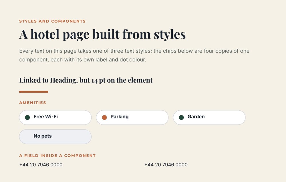
The style lab shows both: every text takes one of three text styles; the four amenity chips are one component.
Styles
Section titled “Styles”A style lives in the document’s styles catalog (up to 500) and has a kind:
kind |
Holds | Applies to |
|---|---|---|
text |
fontFamily, fontSize, fontWeight, fontStyle, fill, textAlign, lineHeight, charSpacing, underline, linethrough |
texts |
object |
fill, stroke, fillPaint, strokePaint, strokeWidth, opacities, dashes, caps, joins, shadows |
shapes, lines, paths, images |
paint |
color (or a gradient as paint) |
the fill or stroke of any element; text and object styles can link a paint with paintRefs |
A style never holds content or geometry: no text, position, size, path or image.
"styles": [ { "id": "5c0df000-0000-4000-8000-000000000001", "name": "Heading", "kind": "text", "properties": { "fontFamily": "Playfair Display", "fontSize": 26, "fontWeight": "bold", "fill": "#1c2430", "lineHeight": 1.1 } }, { "id": "5c0df000-0000-4000-8000-000000000004", "name": "Accent", "kind": "paint", "properties": { "color": "#c0643a" } }]An element links a style through styleRefs — slot text, object, fill or stroke:
{ "$type": "text", "id": "5c0df000-0000-4000-8000-000000000101", "name": "Title", "left": 40, "top": 58, "width": 515, "height": 34, "text": "A hotel page built from styles", "fontFamily": "Playfair Display", "fontSize": 26, "fontWeight": "bold", "fill": "#1c2430", "lineHeight": 1.1, "styleRefs": { "text": "5c0df000-0000-4000-8000-000000000001" } }How styles work — read this before writing them
Section titled “How styles work — read this before writing them”- The element carries its own appearance, and that is what prints. A style does not restyle elements at render time: the editor and the style commands copy the style’s values onto every linked element when the style is applied or changed. In a document you write, give each linked element the same values as its style — as above — or it prints its own values, whatever the style says.
- Changing a style updates every linked element. In the editor, or with
edit_design_template_style(RESTPOST /draft/styles/edit, operationupdate): changing Heading to 32 points and green changed every linked heading in the lab. - Local overrides survive. A property changed on one element — the lab’s second heading kept at 14 points — is
listed in the element’s
styleOverridesand is not touched by later style updates; the other properties still follow the style.reset_overridesputs the element back in step. - Removing or detaching a style keeps the elements’ current appearance.
The practical rule for agents: to restyle a template, update the style through the style command, never element by element; to write a new template with styles, write both the catalog and the matching values on each element.
Styles between documents
Section titled “Styles between documents”The editor exports a document’s styles as a madoo.document-styles/v1 file and imports it into another document, with new
IDs — a copy, not a live link. A new blank document starts with Title, Subtitle and Body.
In the editor
The Styles panel on the right has tabs for text, paint and object styles, each with a preview and the number of linked uses. + creates a style in a dialog with a live preview (for text: Font family, Font size, Weight, Style, colour, Alignment, Line height, Character spacing, underline and strikethrough). Each style’s menu offers Apply to selection (or Apply to fill / Apply to stroke for paints), Edit style, Reset local changes, Detach from selection and Delete style. Export styles and Import styles are in the panel header.
Components
Section titled “Components”A component is a small composition defined once in the document’s components catalog — a chip, a badge, a signature
block, a row of social icons — and placed any number of times as a component_instance. Edit the definition, and every
instance changes.
"components": [ { "id": "5c0df000-0000-4000-8000-000000000201", "name": "Amenity chip", "width": 150, "height": 30, "elements": [ { "$type": "rectangle", "id": "5c0df000-0000-4000-8000-000000000202", "name": "Chip background", "left": 0, "top": 0, "width": 150, "height": 30, "rx": 15, "ry": 15, "fill": "#ffffff", "stroke": "#d0d5dd", "strokeWidth": 0.75 }, { "$type": "circle", "id": "5c0df000-0000-4000-8000-000000000203", "name": "Chip dot", "left": 12, "top": 10, "width": 10, "height": 10, "radius": 5, "fill": "#23493a" }, { "$type": "text", "id": "5c0df000-0000-4000-8000-000000000204", "name": "Chip label", "left": 30, "top": 8, "width": 110, "height": 14, "text": "Amenity", "fontFamily": "Inter", "fontSize": 10, "fontWeight": "bold", "fill": "#1c2430" } ] }]An instance places it and changes what it needs through overrides, keyed by the id of an element of the definition:
{ "$type": "component_instance", "id": "5c0df000-0000-4000-8000-000000000301", "name": "Chip parking", "left": 200, "top": 230, "width": 150, "height": 30, "componentId": "5c0df000-0000-4000-8000-000000000201", "overrides": { "5c0df000-0000-4000-8000-000000000204": { "text": "Parking" }, "5c0df000-0000-4000-8000-000000000203": { "fill": "#c0643a" } } }- An override can change
text,src,frame,fill,stroke,fillPaint,strokePaint,opacity,shadows,visibleandstyleRefs— the words, the picture and the colours. Position, size and shape belong to the definition. "visible": falsehides one part in one instance — the chip without its dot.- A definition cannot contain another instance or a repeated list.
- A field inside a component is one field of the template: every instance prints the same value (the lab’s phone number, twice). For values that differ per copy, use a repeated list; use components for repeated design, lists for repeated data.
In the editor
The Components panel on the right lists the document’s components. + (Create empty component) opens a canvas to design one; Create from current selection turns the selected elements into a component and replaces them with its first instance. Click or drag a component onto the page to place it. Each component’s menu has Insert instance, Edit visually, Rename, Edit selected instance (its texts, images and colours), Reset instance overrides, Detach instance and Delete and detach instances.
Recipes
Section titled “Recipes”| You need | Do |
|---|---|
| Consistent typography | Three text styles — display, body, label — applied to every text |
| A brand colour used everywhere | A paint style, linked by text and object styles through paintRefs |
| Restyle a whole template | Update its styles; check the elements that keep local overrides |
| The same typography in several templates | Export the styles from one, import them into the others |
| Chips, badges, icon rows | A component; one instance per use, with text and colour overrides |
| A signature block with name and role per signer | Not a component with fields — a repeated list, or two fields |
Checklist
Section titled “Checklist”- Every text is linked to a style; local overrides are deliberate.
- In a written document, each linked element carries the values of its style.
- Restyling goes through the styles, not element by element.
- Components hold repeated design; repeated data goes in lists.